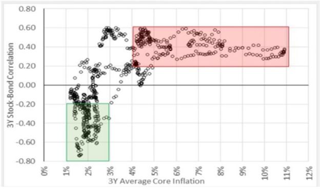
This is the most important chart to watch for asset allocators.
Over the last 10 years people loved bonds because of one simple yet amazing property – a negative correlation to stock markets.
Investors got so used to the negative bond/stock correlation that they assume it’s always going to be there – but history shows that’s not true.
As the chart below from my friend Dan Rasmussen shows by going back almost 200 years:
- The stock/bond correlation is actually positive (!) if is above 3% (red area)
- The magic negative correlation feature only kicks in with core inflation predictably below 3% (green area)
The inflationary year of 2022 was a wake-up call for many: bonds and stocks dropped together and the ’’unbeatable’’ 60/40 portfolio ended up causing a lot of damage.
Family offices, pension funds, endowments and investors around the world who built a portfolio on the assumption that ’’bonds are always a good diversifier for my stocks and risky assets’’ had a very bad time in 2022.
So here is why this is a key chart to watch for macro investors.
Core inflation has been stuck around 3% for a bit, and given the outsized deficits and tariffs it could be this way for quite some time.
Next year, investors might need a hedge for their (failing) hedges – long bonds (and long the ).
A truly diversified portfolio shouldn’t only rely on bonds as a diversifier: for periods of heightened macro volatility, investors should also be exposed to true diversifiers like commodities, , hedge fund strategies like global macro, and other alternatives.
Do you think bonds will act again as a perfect portfolio diversifier?
Or do you also look at other diversifiers like commodities or hedge funds?
***
This article was originally published on The Macro Compass. Come join this vibrant community of macro investors, asset allocators and hedge funds – check out which subscription tier suits you the most using this link.
